Stop building websites with “infinite scroll”!
Scrolling is an every-minute action in our computer life. Since screens have a physical limit, we have to see a part of the whole content which is possible by scrolling.
This post is originally posted on https://logrocket.com/blog/infinite-scroll
Scrolling is an every-minute action in our computer life. Since screens have a physical limit, we have to see a part of the whole content which is possible by scrolling.
“Scrolling” from ancient times to computers
I like etymology. To start to understand what to scroll really is, let’s see where the “scroll” term comes from:
scroll (n.): c. 1400, “roll of parchment or paper.”
In the past, and before the modern “books” exist, people need to write and read information. And when the information goes longer (like religious contents) it gets harder to manage, read and write. And somehow they invented “scrolls”. Which allows people to see a part of a long paper easily.
We met old scrolls when computers came to our lives, because our “scrolling” needs were very close which the ancient people have, and “books” (pile of pages) don’t really cover our need. Because the screen was practically very close to the a single piece of paper but not a pile of papers.
The Evolution of Scrolls in Computers
1. Lines (and Columns)
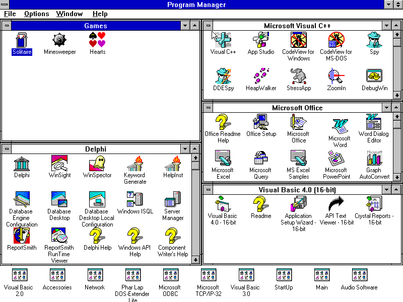
In years, UX people invented/explored many ways of paging/scrolling the content. Before web is popular, we were scrolling “lines” on our screen. Lines are possibly the first scrolled things in computers, just like in real life in past:
Since they have limited space for lines on screen, people invented “scrolls” which basically shows a part of whole content.
Horizontal scrolls made “scrolling” a tool not only to reach the content but also to navigate on the computer screen.
2. Windows (Not the OS one)
Using scrolls to navigate the screen encouraged people to make a screen into smaller screens, which were called “windows”. Using windows, you would be able to have lots of screens on your screen and you would see multiple content at a time.
3. Webpages
Webpages are actually are windows (in browsers). When web become our main focus in computer UX, it become more important. Even “scrolling” solves a very fundamental problem we have while browsing web pages, the web itself brings another problems.
The problem about scrolling experience on webpages
Webpages are distributed. It means while surfing on the internet you may face a non-standard experience which is not really good. And most of the browsers allow web developers (us) to create their own scrolling experience, because the developers mostly do not like how browser scrolling works, or our designer tries to create an interesting, reinvented scrolling experience (which are generally awful).
Scrolls are modifiable. Most of modern browsers allow developers to manage (worse change) scrolling experience in desktop also in mobile. It makes the web an unusable place. The “overriding scroll” disease (smooth scrolling, scroll tweening, etc) may be another title of a post. But please, do not do it, too.
Diving into the experiences invented to “navigate” webpages
I’m going to try to define how developers and designers created experiences to navigate users in their webpages.
Let’s start by learning how our back-end guys design the “pagination” systems:
Offset Based Pagination:
This is the most known pagination system to paginate the content. In this technique, first, we have to find how many items we have to paginate:-- All posts count
SELECT COUNT(*) AS total FROM posts
After counting all the items, we have to calculate the pages. Let’s assume we’ll show 10 items per page.-- First page items
SELECT * FROM posts LIMIT 10
And if we want to skip to the page 3, we need to skip first 30 items using OFFSET.-- Third page items
SELECT * FROM posts LIMIT 10 OFFSET 30
And we will send the pagination information to the client such as following:
{
  "pagination": {
    "items_count": 100,
    "current": 3,
    "total_pages": 10
  },
  "items": [...]
}
Pros and Cons of Offset Based Pagination:
- 👍 Good: Easy to jump to any page.
- 👍 Good: Client is freer about the experience.
- 👎 Bad: Performance issues.
- 👎 Bad: Duplicate items may be shown if data is changed meanwhile.
Cursor Based Pagination:
After the “big data” come to our lives, it become too hard to calculate the “table count” since they are always growing (think about Twitter). So, developers came with newer technique to paginate the data: cursors.
This is the newer pagination technique to solve the problems which offset based pagination has.
Every row must have a unique cursor. We do not have to count all the table which it makes it impossible to know actual page count:-- Get extra 1 item to get its cursor.
SELECT * FROM posts ORDER BY id DESC LIMIT 11
Assume every post have a unique cursor field (or its ID in this example) to help pagination. Client will have pagination information such as following:
{
  "pagination": {
    "next": 1234 // extra item's ID (cursor), null if end of data.
  },
  "items": [...]
}
And we can ask for next page using cursor:-- Offsetting records using 1234 cursor
SELECT * FROM posts WHERE id >= 1234 ORDER BY id LIMIT 11
Pros and Cons of Offset Based Pagination:
- 👍 Good: More performant, no table counts.
- 👍 Good: Showing duplicate items is not very possible if someone inserts a row center of the table.
- 👎 Bad: Impossible to jump to any page.
- 👎 Bad: Client is not free with the experience, total page and current page is not calculated.
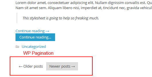
1. “Next” and “Previous”
The Experience: Click Based
The Technique: Offset Based or Cursor Based
This is mostly used to navigate blogs. This is the oldest version of “infinite” scrolling. We may not know the end of the content.
2. Numbered Pagination
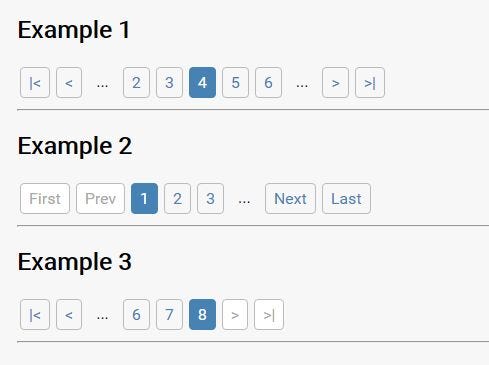
The Experience: Click Trigger Based
The Technique: Offset Based
This is the most usable (according to me) navigation type. It uses offset based pagination which allows you to “jump” to the page you want, or go to the end or beginning with just one click.
Google also have this kind of navigation in search results:

3. “Load More”
The Experience: Click Trigger Based
The Technique: Cursor Based — may also be offset based but would be awkward
This is one of the newest paginations over time and it’s also the previous version of infinite scrolls.
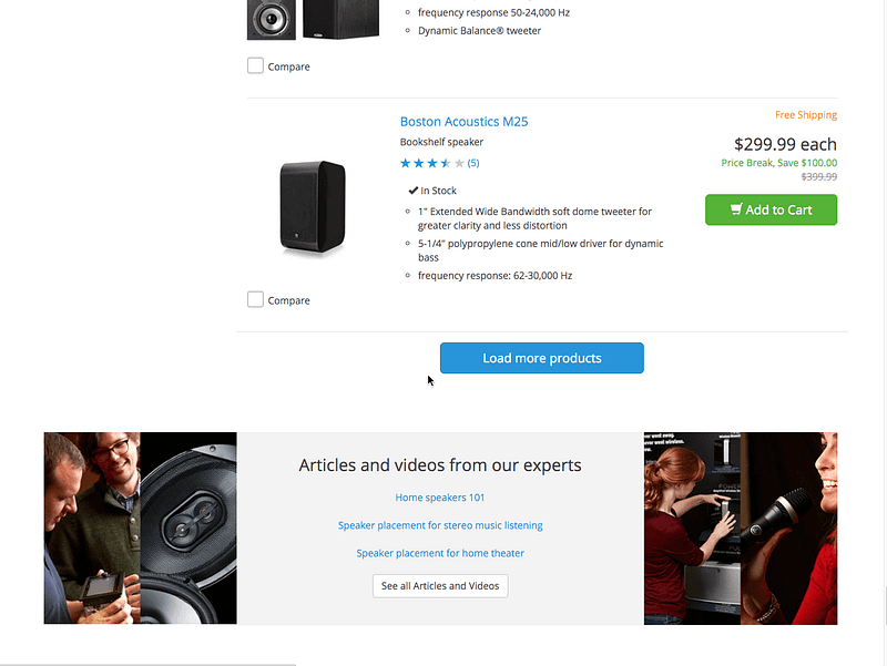
In the example above, user clicks to “Load More” button to see the next content.
4. Infinite Scrolls
The Experience: Scroll Trigger (not intentional) Based
The Technique: Cursor Based — may also be offset based but would be VERY awkward
Infinite scrolls are the newest experience of “cursor based” pagination technique. But it doesn’t really help us in many ways and still people love it to use this technique.
Hugh E. Williams claims he invented “infinite scroll”in 2005 on Microsoft. You can read his story: https://hughewilliams.com/2012/03/06/ideas-and-invention-and-the-story-of-bings-image-search/
Metafizzy also created a tool to help developers to build infinite scrolls: https://github.com/metafizzy/infinite-scroll

Part 4: Stop building websites with infinite scroll!
Up to this part, I tried to tell you how we end up with building websites with infinite scrolling. And in this part, I’ll try to tell you why infinite scroll is not a good idea and has bad experience.
“Finding Footer”
Footer is a very basic unit of a webpage anatomy just like a header. Sites keep some detailed information and links on footer section such as phone numbers, addresses, help and support links. If users need some help, they mostly scroll down to the find footer.
With infinite scrolls, you’ll get your users mad when they try to find the footer. While their intention is to see the end the page, infinite scroll makes it impossible. The site does not have “footer” anymore and footer is an important part of a website. Going to end of a webpage is not possible and it makes user stressed not to reach to the end which makes your user experience very bad.
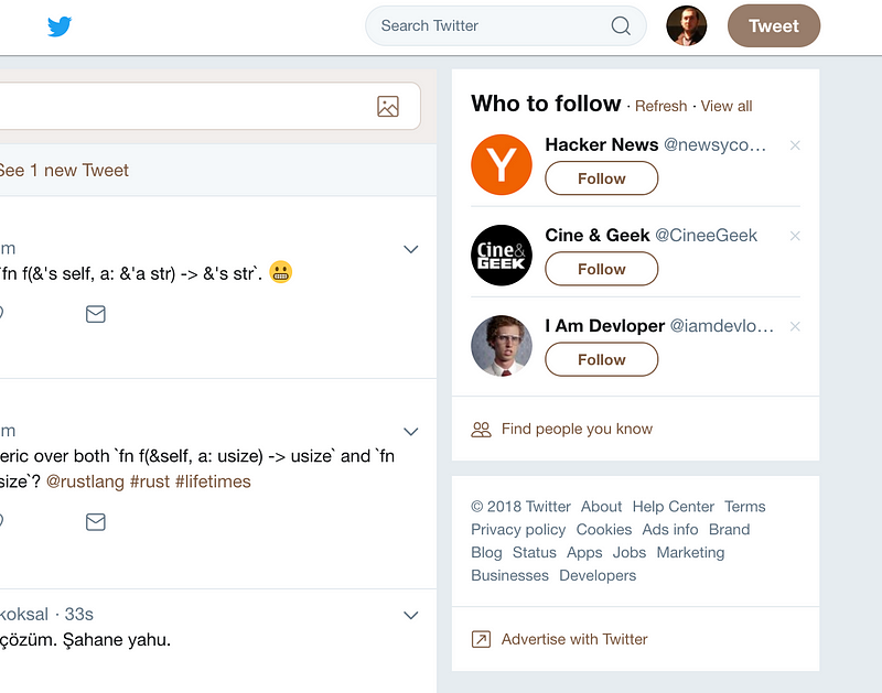
The sites with an infinite feed (like Twitter) solves the footer problem putting these required information and links to the sidebar. Sidebar is a solution for this issue but still not a good one. Footer should stay on footer.
Do not use infinite scroll if you do not have “timeline” or “feed”
“Social media” applications (Twitter, Instagram or Facebook) work with the “time”. That’s why Facebook calls your content “timeline”. Users’ intention is to navigate their (or friends’) past. In this case infinite scroll makes the navigation easier.
If you have “feed” or “timeline” in your website, use infinite scrolls. Because users’ intention is to trail the content by time. Also in this kind of experience, infinite scroll is good for performance especially in mobile.
But if you have an e-commerce, news, magazine or a blog website and users’ intentions are to move around the “items” or “articles”, infinite scroll becomes a nightmare for them. In a timeline based list, people mostly don’t look for a “date” or do not search a unique moment. On item based lists, the user wants to find an item. Infinite scrolls make your items almost impossible to find by your users.
Give users more control
User experience is mostly to make the user to feel they have the control. Users do not like the UIs when they don’t feel they cannot control it.
Scroll event is not very intentional to “do” something. People navigate the page, and if they want to call an action they mostly “click” or “touch” which are “triggers”. They feedback the UI about their decision. But scroll is triggered without any decision.
“Scrolling” is actually “looking around”, not a “trigger”.
Infinite scrolls make the pages “less controllable” for the users. They scroll to see some content and something happens without their control. And sometimes they see a “jumping glitch” if the front-end developer is not designed the page very well (mostly they don’t). Instead of infinite scrolling, put a “load more” button which is a trigger. This will give the control to the user. (I’d prefer old style numbered pagination but we assume we use cursor based pagination right now).
Allow users to go to page wherever they want
As I mentioned before, people do search for an item. And searching is not always “writing a query”. “Looking around” manually is another way to search which we call “surfing”.
People navigate between pages, moves next and previous, bookmark some of them, shares a page with their friends, etc.
Infinite scrolls are stateless.
Infinite scrolls cannot keep the state by its design. Users cannot share their current state. Which also makes you cannot track users’ actions using analytics tools.
It’s almost impossible to make your users to go wherever they want within your “pages” if your back-end paginates cursor-based. If you have a e-commerce website, give users control to navigate the products as they want.
Additionally, if you have a “sort by” functionality in your listing, you must show user a pagination. In alphabetically ordered list you mustn’t force users to scroll down to products with the capital of K. They will go mad with this experience.
You should allow users to see where they are. Using infinite scrolls, people cannot see where they are because of its design. They scroll for a time, since its a stateless design they do not know how many times the “next page” loaded. When they refresh the page, they will go reset all the way back, and to go to page they were before, they have to scroll down for a time, again, unfortunately.
Infinite scrolls are nice in few cases but it’s mostly not a “problem solver” but a “problem maker”. UX people shouldn’t consider “infinite scrolling” as a silver-bullet to solve their pagination issues. Stop building websites with infinite scrolls.
Conclusion
I tried to tell you how the “scroll” has existed in time, how the “scroll” become a part of computers, how the “scroll” experience evolved into different experiences with different techniques in web and what are the consequences of these experiences. And at the end, I tried to tell why “infinite scrolling” is mostly not a good experience to build on your websites.
I don’t know what the future will show us or will someone invent another pagination technique or scrolling experience.

Discussion